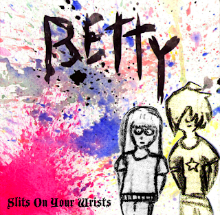
This is the finished version of Sam and my music video.
Friday, 20 November 2009
Finished Digipack Designs
'In what ways does your media product use, develop or challenge forms and conventions of real media products?' (Part One)
Here are the nine key frames that we took from other music videos.
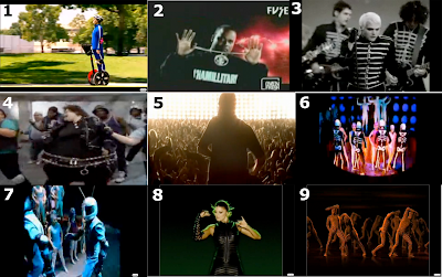
This is a selection of 9 key frames from selected music videos. *Click to enlarge the image*
1: This is a shot of the music video for ''White and Nerdy" by Weird Al Yankovich, we chose the shot because at this point in the video the character is riding a segway and the lyrics are "They see me roll on, my segway". Clearly with the video referencing the song.
2: Is a shot from Chamillionairre's "ridin' dirty'', This shot tipifies the way the record label want to portray the artist because hes a gangsta with a big chunky chain infront of bright lights making him seem very important and powerfull.
3: Shot 3 is of My Chemical Romance's song ''Welcome to the black parade'' it illustrates the typical 'Emo' genre that MCR are commonly put into by having everyone dressed up in alot of black with pale make up etc.
4: The 4th shot is from another Weird Al Yankovich song called ''Fat'' the song is a mock of the micheal jackson song ''Bad'' and there for has extensive intertextual refrences to micheal jackson and his style etc. The video is a literal copy of Jackson's video but with altered lyrics and characters, it is a parody.
5: This screen shot shows a good use of camera technique by framing the crowd half brilliantly with the artist silhouetted in front. The way it is framed makes the performing artist This shot also uses lighting to create the desired effect.
6: Has a good effect of lighting by making the outside in total darkness and only lighting the center where the dancers are, much like the effect we attempted to have in our video, the lighting is also selective, giving each 'sound' a different light.
7: Demonstrates a clear use of mise-en-scene by putting each group of dancers in a different costume, these different dancers represent a different sound and rhythm in the song.
8: This is a shot of the Black Eyed Peas video for their song 'Boom Boom Pow'. I think that it relates to our video well as we have our lead singer Rosie dancing in a similar abstract style in front of a completely white background, which relates to this singer standing in front of a background that's completely green and black.
9: At this point in the video I took this screen shot as the song quotes Daft Punks' lyrics ''Harder, Better, Faster, Stronger'' as well as the dancers in the background are dancing in relation to the sounds and beat like in Around The World, also by Daft Punk.
'In what ways does your media product use, develop or challenge forms and conventions of real media products?' (Part Two)
.png)
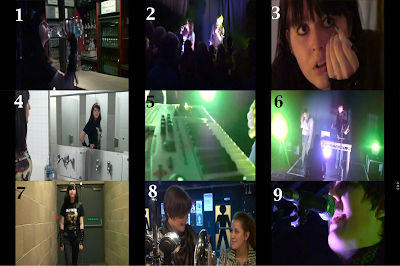
*Click on the image to enlarge*
1: This image (taken in the bar scene) shows our main character stealing some vodka from the bar. This section is accompanied by lyrics saying 'stole some vodka, took a swig'. Showing that we have related our narrative to the song. This happens quite a lot in the song and video, however none of them are as synchronised as this.
2: This image typifies the way the record company would want their artist to be presented as it depicts the band standing on a stage in front of a seemingly large crowd of cheering fans. Making the band seem loved and popular.
3: This is a shot of Becky dressing up in an 'emo' style. This is a clear representation of genre, as emo is one of the largest groups of fashion around. This also correlates to the song name being 'Slits on Your Wrists' as self harm is a trait often associated with the emo style.
4: The bathroom scene in musics video is a very common affair. For example the music video for Bowling For Soup's song Emily revolves around this sort of venue style toilet. And also this bathroom reminded us loosely of the one used in the film the Shining (that was also recreated in the film Charlie's Angels).
5: The camera styles we use (mostly in our live show footage) are often 'up-close and personal' to the band. They show the band and the bands' equipment closely and in detail whilst always maintaining a hectic moving theme to make the video seem more lively. This shot perfectly shows the combination of stylistic lighting and equipment shots we have tried to integrate into our video.
6: This shot shows our use of lighting in the video. Our most prominent lighting design was in the live show. We sent a clear email to the lighting staff at the junction describing what it was that we wanted. I think it turned out really well. At one point we also had a strobe light which worked really well with the video but I couldn't capture a picture of the strobe effect.
7: This shot not only shows our location, but character and clothing mise-en-scene. It shows the girls dress, the Junction and her make-up and hair.
8: This shot I got the idea from from watching other music videos. I liked the idea of the characters in the background and an inanimate object occupying some of the foreground. I think it makes the shot more interesting, as well as more stylised.
9. Before we filmed our music video I was watching a video for the live performance of the singer José González' song Heartbeats. I noticed that it looked very effecting because it used several close up shots of the equipment (such as the microphone and the guitar) and the singers face. I tried to recreate some of this style when filming, and this shot is the result.
'How effective is the combination of your main product and ancillary texts?' (Part One)
This is the script we used for the voice over.
[Introduction] - Say names:
'Hi, I'm Alexander Whitcombe'
'And I'm Sam Chappell-Winnington'
'And we are the makers of the Slits on Your Wrists video by Betty'
1 - Talk about the camera work of the video.
2 - Talk about the digipack designs.
3 - Talk about the special effects editing and cutting.
4 - Talk about both of our magazine advert designs.
'How effective is the combination of your main product and ancillary texts?' (Part Two)
This is a voice-over we made to our video to answer the question above. In it we talk about the effects and filming in our music video. As well as the digipack and magazine advert designs.
'What have you learned from your audience feedback?'
Class rough cut feedback:
Social networking feedback:
It follows the typical ‘narrative music video’ structure: it starts with the equilibrium which sets up the narrative before the song itself starts. It then progresses to follow-up the narrative interspersed with both crowd action and shots of the band themselves. The band then proceeds to dominate the video before the fade away. In addition to this, technical features such as the production companies and the title of the song and name of the band at the start of the video also make it seem professional.
Very good editing control: looks professional. Cut to the beat which I think emphasises the rhythm of the music. I particularly liked it when it cuts as Rosie motions with her arms in time to the beat, (just before the ‘drop’ is it?). Overall kept with the pace of the music, didn’t lag behind or move too fast. Good use of special effects with the fading in and out and the white-light backgrounds for Tom and Rosie. General look of the video seemed to be in keeping with the tone of the music and the narrative followed the lyrics fairly well. Camera work looked professional, not excessively slick, but in the style of music videos during the performance sequences especially. Being present at the filming of the crowd scenes I know how unresponsive the crowd initially was, and how they didn’t appear to fill the space. The camera shots don’t show this at all but instead give the impression of a packed venue.
I think that generally looks very good; however, there are a few, subjective, issues that I had with the video. The narrative doesn’t appear to conclude fully which means that it seems unresolved, this is a noticeable issue as the setup isn’t fully explored. The title shot fades too quickly to see what the focus-pull has revealed. In one or two of the shots of the band performing the lighting is a bit excessive and washes out Tom’s face.
They thought that the shot with Rosie dancing in front of a white background was a bit tedious, and that there wasn't enough going on. However we thought that the lack of events in that time made the sudden fast cutting and active live footage straight after this scene more effective. Also, the band liked that scene very much, so we had to find a compromise for both. So we added the effect of fading Rosie in and out of the white background as she sings to make it more interesting to view.
When the main narrative character is in the bathroom, we were told that this section wasn't broken up enough, and that it was far too slow paced. We solved this problem by adding snippets of the life footage and breaking up the clips to the beat of the music (like we did near the beginning of the video when she was walking) so that they came over as more energetic and lively. The time cutting also added pleasing effects to the overall look of the video and scene.
We also had a lot more footage at the beginning of the video. We were told we had too many hair dying shots, they stretched out to almost fifty seconds without the music even starting, so we sorted out the most effective shots that got the point across and looked the best out of all of them before got rid of all of the other shots. This made it far more snappy and brings it down to a normal length of time before the music starts for a standard music video.
There was also a shot near the beginning of the video that didn't look right as it lasted too long. We cut this down and added a different line of video footage as well so it looked better.
Junction feed back:
On thursday 5th of november we went to the junction again for a group veiwing and feedback from a panel of judges from the junction who both have twenty plus years of experience in the industry. Sadly, ours wouldn't play very smoothly due to the laptop it was on and after it was played they got a different laptop to play the rest, but the quality was still good enough to get some feed-back from.
After watching our video Pete Edwards and Rob Tinkler gave some feed-back. They said that it tells a good story (the narrative was effective) and the actors are very believable. They also said that the live shots look profesional and the crowd looked far bigger than it was (thirty people). However they did also say that whilst both the live show and narrative sections are good individually, they don't blend together very well, which spoilt the flow of the video. They also made the point that we should establish the artist earlier on.
Digipack rough feedback:
People said that the back cover of my digipack didn't really match the front cover. They said that the colour scheme didn't really work either, and that I should find a new influence. I solved this by making the images from the front cover appear to 'creep' onto the back cover. Outlining the back cover in the style of the front, slowly letting the image fade into the back cover.
I also originally hadn't designed a CD. After having feedback that I should design a CD to add the finishing touches to the digipack, I did. This also greatly influenced my magazine advert as I used the image I created for the CD on it, as well as naming the album in relation to this image.
They thought that the cut outs worked well, especially with the style of the music, and that the background went well with the 'eclectic style' of the music video. They also thought that the digipack had a good design, which makes getting the CDs and booklets easily accessible.
Social networking feedback:
In what ways does my video remind you of other music videos?
It follows the typical ‘narrative music video’ structure: it starts with the equilibrium which sets up the narrative before the song itself starts. It then progresses to follow-up the narrative interspersed with both crowd action and shots of the band themselves. The band then proceeds to dominate the video before the fade away. In addition to this, technical features such as the production companies and the title of the song and name of the band at the start of the video also make it seem professional.
It has a narrative behind the video with fast paced editing as engage the viewers' attention to the piece. Due to the handheld camera, it fits into the indie music genre of underground video like that of early Hadouken or more recently the band Hockey.
What do you think are the strengths of my music video?
What do you think are the strengths of my music video?
Very good editing control: looks professional. Cut to the beat which I think emphasises the rhythm of the music. I particularly liked it when it cuts as Rosie motions with her arms in time to the beat, (just before the ‘drop’ is it?). Overall kept with the pace of the music, didn’t lag behind or move too fast. Good use of special effects with the fading in and out and the white-light backgrounds for Tom and Rosie. General look of the video seemed to be in keeping with the tone of the music and the narrative followed the lyrics fairly well. Camera work looked professional, not excessively slick, but in the style of music videos during the performance sequences especially. Being present at the filming of the crowd scenes I know how unresponsive the crowd initially was, and how they didn’t appear to fill the space. The camera shots don’t show this at all but instead give the impression of a packed venue.
Has continuity in edit and a variety of techniques.
What do you think are the weaknesses?
What do you think are the weaknesses?
I think that generally looks very good; however, there are a few, subjective, issues that I had with the video. The narrative doesn’t appear to conclude fully which means that it seems unresolved, this is a noticeable issue as the setup isn’t fully explored. The title shot fades too quickly to see what the focus-pull has revealed. In one or two of the shots of the band performing the lighting is a bit excessive and washes out Tom’s face.
Could be argued that the camera work is handheld that it is not professional but could add to the charm. Is quite blurry in places though, but you mentioned that this was intentional.
'How did you use new media technologies in the construction and research, planning and evaluation stages?'
Here is an image I made on Photoshop showing all the physical and digital equipment we used.
This includes an HD camera, a Mac G5 computer (along with a mouse, keyboard and screen) with the programs Final Cut Express, After Effects and Photoshop on it. These pieces of software and hardware have influenced our project very heavily. Using these we were able to create lots of effects such as editing the blue screen footage, and cutting the clips (which allows us to cut to the beat and use different sections of footage whenever we wished to). If technology were not so advanced we would be met with a series of problems such as:
- The special effects in our video from After Effects could not exist, there would be no such thing as blue screening, colour correction, overlapping effects or typography. As a result of this our video would suffer. We wouldn't have had any of the blue screening, layering or fading effects.
- Without social networking such as MySpace, Facebook and Bebo, many of us would not have originally been able to contact the band they wished to make a music video for. Meaning they would have to use a local band, like ours. We would also have had to advertise our music video using posters or leaflets. Producing these would cost money where as advertising online is completely free and is an easy way to quickly communicate with your friends. Being your friends, they would be more likely to partake in helping distribute and making the videos. For our video, our whole crowd was created by inviting people on Facebook to come.
- If we didn't have Final Cut we would have to use the 'crash editing' technique. You do this by using two tapes and cutting from these instead, completely skipping the use of editing programs which would make life a lot more difficult and would make the video less effective. We would also have to me a lot more selective with our filming, meaning we would miss some of the better footage.
- The HD cameras are also much more effective than the DV cameras. They produce a much higher quality of video improving the overall look. Using DV cameras produces a much more grainy image quality.
- Using websites such as YouTube and Vimeo, we are able to broadcast the things we make to an enormous audience. It stops just being a local audience and immediately becomes viewable worldwide. If these websites didn't exist then we would have to show the video to a media producer/advertiser to get it public in any way. As well as leaflets, posters etc. that I mentioned earlier. Feedback can also be given in the form of YouTube comments and Facebook feedback, rather than us having to show it to an audience and them to log their feedback.
Friday, 13 November 2009
Betty CD
Finished Poster:
Inside Digipack Design
New Album Covers
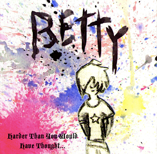
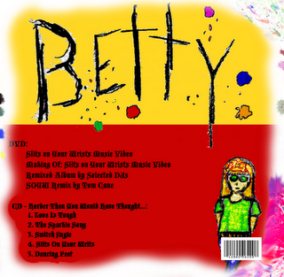
Here I have added the real album name (Harder Than You Would Have Thought...) to the cover of both the front and back of the digipack covers:
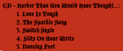


This is a close up of the change I made to the back cover. You can clearly see that in now says 'CD - Harder Than You Would Have Though...' rather than 'CD - Betty'.

Thursday, 12 November 2009
Magazine Digipack Advertisements
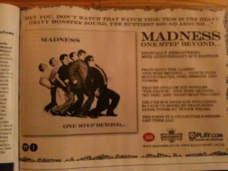
This magazine advert for Madness draws from the band's name. It advertises obscurity in the music using the bizarre image on the cover. The advert clearly states what is in the digipack. 'Featuring the classic 'One Step Beyond...' album plus bonus tracks, Peel session and videos.' It then goes on to advertise the tracks, and a '24 page CD booklet featuring Liner notes by Irvine Welsh.
The whole advert is written in block capitols making it stand out. As much information as possible is written in a positive form, making the product sound far more appealing to the reader, and finally at the bottom is featured the production company logo, the band logo, and the logo for Play.com which would be a selling point of the digipack.
Here is the advert:
This is a digipack advertisement for the Foo Fighters' 'Greatest Hits'. Their logo appears to be printed onto the side of a plane fuselage, the rough surface and finish of the plane gives the impression of a readily finished war plane. Making the album appeal to a male audience.
As with the Madness advert, it shows tracks included on the album to attract the attention of someone who knows the band well, or has heard one of their songs on the radio/television.
This advertisement for Devendra Banhart has chosen a very simplistic design, drawing most of the attention to the intricate and abstract cover design. It also has the words 'OUT NOW' on it, which correlates to the Foo Fighters' album having 'NOVEMBER 2ND' on it. They both advertise the availibility of the product.
And, as with the two adverts before it, this one also tells the reader what single to expect from the album, attracting those who have heard the songs before.
If I have time I think that I will modify my posters so that they include a section explaining what popular singles are in the album, as this seems to be popular in these adverts.
Wednesday, 11 November 2009
Digipack Front Design
Here is a design I made quickly of the completely folded out front design of my digipack:
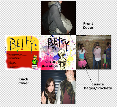
The front and back covers will have plastic casings so that they clip together and all of the other pages fit nicely inside them, like a normal CD album.
Betty Poster One and Two
Here is the first poster that I have made for Betty's album. I got the photo in the background from the website Flickr. It was non-copyright, so I would be able to use it for my poster without being sued.
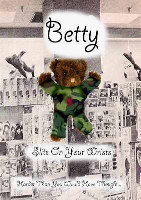
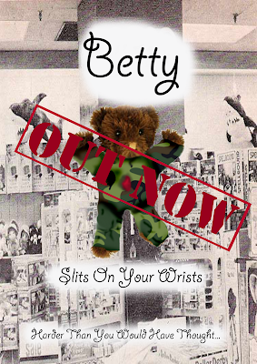
After I made this I also made another poster with a sign saying 'OUT NOW' printed over the teddy to advertise the album's availability. I did it in the style of an army stamp to correlate with the teddy bear's military clothing.
Tuesday, 10 November 2009
Poster Symbol
Our Second Cut
This is the new version of our video.
I made some minor edits such as shortening the intro (where she is dying her hair) and added scenes of live footage to the bathroom scenes to break them up a bit.
Dancing With White Background
When we spoke to the teachers, they criticised the bit of our video where Rosie (the lead singer) is dancing slowly in front of a white background. They said that the audience will find this section of the video boring. However we spoke to the band with the pretense of changing it. However, when we spoke to the band they expressed how much they liked the scene, and that they'd appreciate us keeping it in.
This left me with the problem of having to please the band, whilst keeping it interesting, so I added an effect to it where it gives the appearance that Rosie is fading in and out of the white background as she sings. It's not perfect, but I think it makes the scene more interesting, whilst keeping both parties happy.
Monday, 9 November 2009
Back Cover Design Two
I just edited the back cover design of my digipack. Here is what the new back cover looks like:
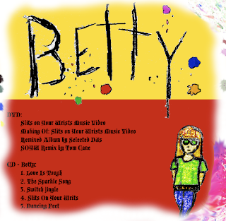

I have aligned a lot of the colours with the splats on the front cover so it gives the effect that the colours are carrying over to the back cover from the front.
Extra Pages in Digipack
For the pages that aren't the front and back covers I will add images relating to the band members, and images of the live show from the music video. Such as these:
Digipack Designs
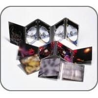
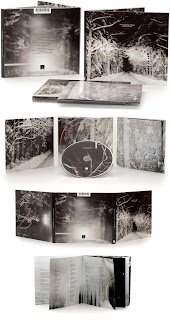 This is the most popular design of a digipack currently used. It folds out into a long string of pages containing extras. Such as extra disks, booklets etc. Below is a DVD series case that uses the same style of design:
 Here are a couple more digipack/album designs:
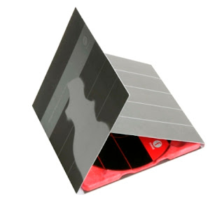 Despite the above being the more popular designs, the design I want to use would be in the style of this Gorillaz album:
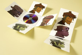 Even though this isn't a digipack itself, it still follows the design of a lot of digipacks. There would be other spaces for extra CDs/DVDs, booklets and other things in the side pockets (that in this Gorillaz CD case, have nothing on them). For example, where one of the faces are on this album, in my digipack case there would be a little pocket for a booklet , or an extra CD/DVD space.
I also find this design more aesthetically pleasing as it is more compact and less messy. It is also easier to locate what you want from the case when you need it.
Friday, 6 November 2009
Back Cover Inspiration
For my back cover of my digipack my original inspiration for the colour scheme was from the album 'The Clash: Greatest Hits' shown here:
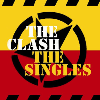

However, I don't think that the colour scheme works with my designs, so I am planning on changing it.
Front/Back digipack images...
How I will be creating my album covers...
Contents of Digipack
My digipack will contain:
One CD
One DVD
Two Booklets
The first disk (CD) will contain the bands mini album. It contains five songs. It will be displayed on the digipack as such:
CD - Betty:
1. Love Is Tough
2. The Sparkle Song
3. Switch Jingle
4. Slits On Your Wrists
5. Dancing Feet
The DVD will have the music video for Slits On Your Wrists, the making of video and extra footage, the album remixed by a selection of DJs and the main single (Slits On Your Wrists) remixed by Tom Cane, the keyboardist and sampler (the male half of the band).
It will be laid out like this on the digipack case:
DVD:
Slits On Your Wrists Music Video
Making Of: Slits On Your Wrists Music Video
Remixed Album By Selected DJs
SOYW Remix By Tom Cane
The first booklet will be one of artwork and inspirational references by the Rosie Cane, the lead singer (the female half of the band). This will contain artwork drawn by her, and inspirational references.
The final extra will be a booklet contained in the bottom section of my digipack. It will contain lyrics, special thanks, web references and website links.
Tuesday, 3 November 2009
Digipacks:
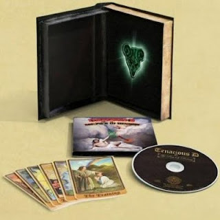
Our class have been asked to make a 'digipack' for our artist/band/video. A CD digipack is generally a four page spread consisting of an outer front and back cover and two inside pages. Digipacks always contain a bonus item. Be it a physical object of interest, a DVD with commentary, behind-the-scenes footage, exclusive interviews with the members of the band etcetera or something like a CD with bonus tracks. In all they just have something that gives them worth to own over just downloading the album for free off the internet. For example, the digipack for the band Tenacious D's album the Pick of Destiny contains a plectrum replicated from the one featured in the feature film of the album (contained in the Deluxe Edition of the digipack, shown below).
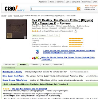
A digipack must have an aesthetically pleasing cover to attract an audience. Especially so that it attracts the traget audience, such as the correct age range. It has to appeal mainly to the type of person who will listen to (and like) the music that is contained in it. It is preferable to have the interior of a similar quality/style too.
Here is what the actual digipack looks like:
Process of Editing
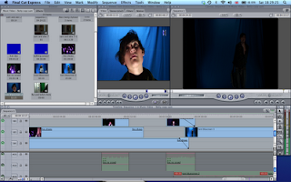
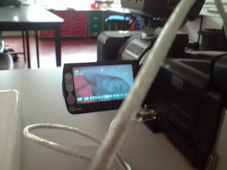
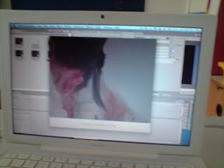
Here are the photos and screenshots that Sam and I took from the editing process:
Firstly, we take the footage off the camera...
...and import it into Final Cut Express.
We then use Final Cut to cut up the video clips and arrange them into an appropriate order.
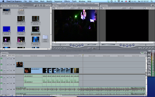
We have to cut them with the music and make sure that they look good.
Subscribe to:
Comments (Atom)


